Errors have always been an important part of philately. They are in high demand and can sometimes be quite expensive because their flaws have unintentionally created some of the rarest and most visually striking stamps in the world. Two such examples are our world famous Blue and Orange ‘Post Office’ stamps.
Their price depends on their conditions and on their rarity. Stamps authorities are extremely careful and ensure that stamps are printed by Security Printers under strict supervision where checks and counterchecks are constant and thorough. Errors therefore occur because of human oversight and mechanical faults.
What are philatelic errors?
Errors can be described as ‘anything that is different from a normal stamp’. A “normal stamp” is a stamp that is issued in the state in which it is intended to be issued by the postal authority, printed in the intended colour, with the correct perforation, with the correct value.
Philatelists reserve the term ‘error’ for obvious production failures. Printing plate cracks, wear and other flaws such as repairs or re-entries are not considered to be errors.
Different types of philatelic errors
As mentioned, an ‘error’ refers to failures which can occur in the stamp production or printing process. They result in the finished product not having the intended appearance. They can have serious visual mistakes that are repeatable and, as a result, are very scarce.
Errors come in two categories:
- Design errors, i.e. mistakes made by an artist when creating the image to be used on the stamp. Most of those are considered to be of minor status although notable exception exists (such as the ‘Post Office’ stamps, considered as a design error by Barnard at the time);
- Production errors, i.e. errors occurring during the manufacturing process. These are generally considered to be major and therefore more important.
1. Design Errors
Design errors occur when a mistake has been made during the design phase of production. This can range from a minor mistake such as a missing letter in the name of a subject to more serious errors such as the wrong picture of a subject, out of date maps, misspelled text or an inscription that is factually incorrect. They are known as ‘errors in design’ or ‘Artist errors’ and are not always recognized as philatelic errors, because the ‘errors’ and the normal stamps are the same.
There are a few notable examples in Mauritius (the list shown below is illustrative, not exhaustive). Although they show obvious mistakes, many are however not considered as ‘’errors’, with significant philatelic value (other than their face value), because they were all issued in the state in which they were intended to be issued.
Examples of artist design errors:
- The most famous design errors in the history of Mauritian philately are the two pence Blue and one penny Red (also known as “post office” stamps. The cover below is known as the Bordeaux cover.
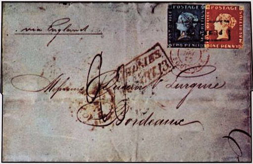
The stamps were engraved by Joseph Osmond Barnard in Mauritius and the designs were based on the then current issue of Great Britain stamps (first released in 1841), bearing the profile head of Queen Victoria. The first two stamps were issued in two denominations in similar colours to that of the British stamps. The wordings were later corrected to ‘Post Paid”, which de facto, made speculators think that it was indeed a design error.
Only 500 of each were printed from a single plate bearing both values. They were notably used on invitations sent out by the Governor’s wife for a ball which she was holding.
In 1993, the Blue Penny alone was sold at £1 million. The famous Bombay cover franked with two rare 1-penny “Post Office” (red) stamps realized €2 million. The current price of the world famous “Bordeaux cover” (shown earlier in this blog) is estimated to be worth between 4 to 6 million Swiss Francs in 1993 in David Feldman‘s catalogue.
2. Example of errors on maps
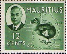
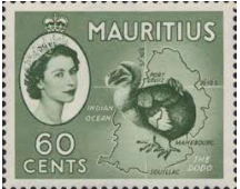
In 1950, the definitive series of King George VI features an error on the 12-cent stamp, which showed the Dodo bird and map of Mauritius, with incorrect latitude for Port Louis as 21 degrees, rather than 20. That error was not corrected in this series.
However, 3 years later, when the stamps were re-issued in 1953, after the coronation of Queen Elizabeth II, the error was corrected to feature the right latitude of Port-Louis as 20 degrees.
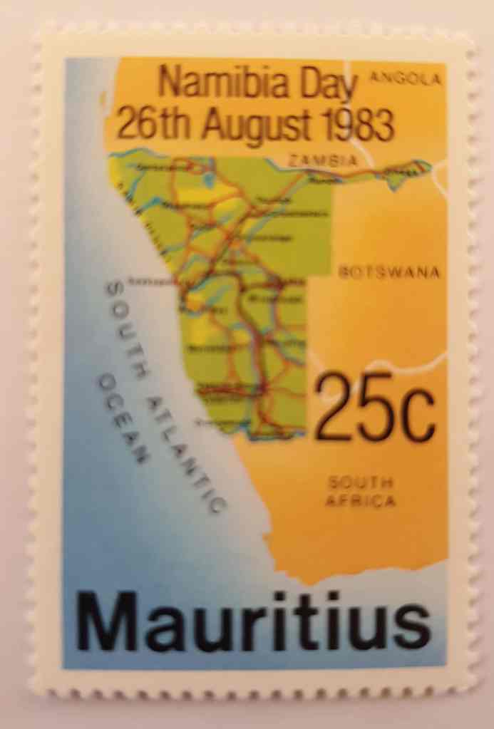
In 1983, a series of 4 stamps were issued on Namibia Day. The 25 cents shows a map of Namibia, where Zambia and Angola are incorrectly shown
3. Examples of misspelt names/ inscriptions
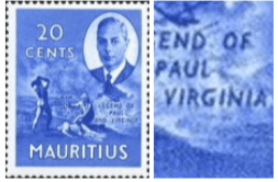
In 1950 King George VI definitive series, the 20-cent stamp is incorrectly inscribed with the name “Virginia”. This stamp features a scene from the famous book of Bernandin de St. Pierre about the legend of Paul and Virginie. The inscription should read “Virginie” (the name is not translated in English). Contrary to the 12cs stamp with an incorrect latitude, this wrong inscription was NOT corrected when the stamp was re-issued in 1953.
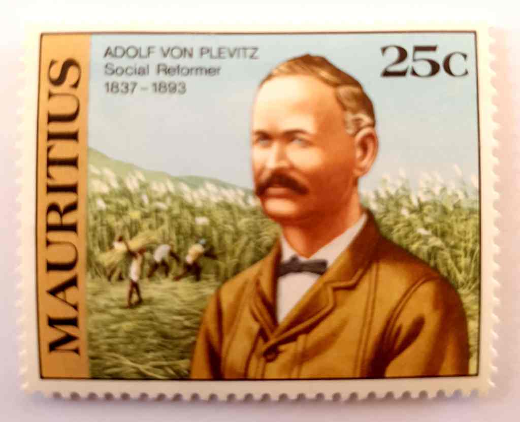
In December 1983, a series of stamps was issued to commemorate the contribution of Adolphe de Plevitz to the rights of Indian immigrants in Mauritius. The 25 cs shows a picture of the social reformer. However, he is wrongly named (including on the Rs. 5 and Rs. 10 respectively) as Adolphe von Plevitz instead of Adolphe de Plevitz.
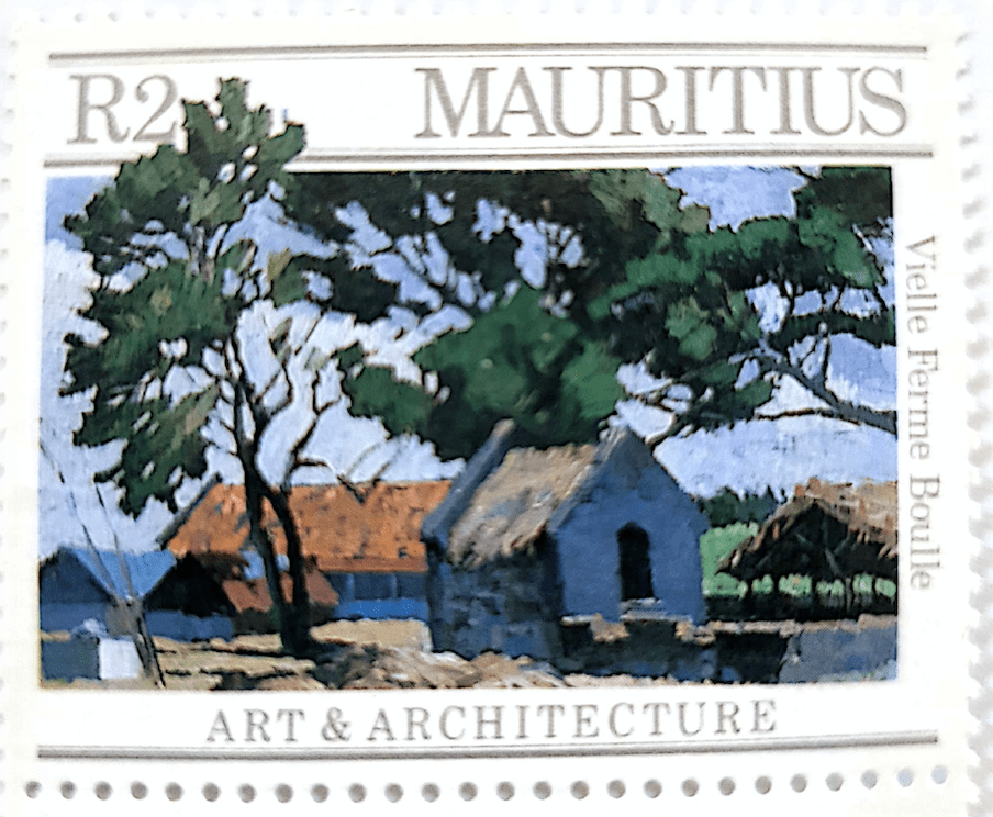
In the 1987 series on Arts and Architecture, a spelling mistake can be observed on the Rs. 2 stamp, which features an old farm, named ‘Vielle Ferme Boulle”. The term ‘vielle’ is a grammatical mistake for the word ‘vieille’ meaning old in French.
In the series ‘Traditional Games” released on 7 December 2006, the Rs. 15 stamp shows children playing hopscotch. The word is written “Hop Scotch” instead of “Hopscotch”, a misspelt error which was never corrected nor really highlighted.

In December 2007, another noticeable design error was made on the Rs. 5 stamp of the Anniversaries and Events series. This one is quite spectacular by the number of errors on a single stamp. Three ‘errors’ appear on the Rs. 5:
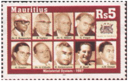
This stamp has an error on the picture of A.M Osman (bottom right) 
This stamp shows right A.M Osman
- The R. 5 stamp portrays A.H. Osman, which is the wrong person. Instead, A.M Osman should have been portrayed. This was corrected and the stamp was pulled out and replaced by the correct person.
- Dr. G. Millien, should read Dr. E (for Edgar) Millien. The error was not corrected in the re-issued Rs. 5 stamp;
- R. Vaghjee should read Sr. H. (for Harilall) Vaghjee. Again, not corrected in the new issue
The value of the Rs. 5 on the market is not higher than its face value, because it is not considered as an ‘error’ by philatelic terms. The initial Rs 5 was subsequently removed from the market and replaced by a new issue featuring the right portray of A. M Osman on demand from the Osman family. However, this has not increased the value of the initial stamp.
4. Examples of incorrect colour in design
In December 1987, a series of 4 stamps was issued on Arts and Architecture of Mauritius. The R. 1.25 stamp shows the wrong the colour of the roof (red instead of grey) and the wrong name of the Chateau, which is called Chateau de la Villebague, and not Chateau de Rosnay (which is the name of the owners) as mentioned on the stamp.


The actual roof is grey
2. Production errors
These errors occur during the production process and is the result of human or machine oversight, which normally should not have happened. It therefore creates stamps that are different from the intended and original ones, making them more valuable for philatelists. Common production errors are as follows:
(i) Value or denomination error or substituted subject: For example a low-value denomination has been used on a design intended only for high values.
One such example is the Rs. 2.50 OCAM stamp issued in May 1973. Some stamps have the R. 2.50 value missing as well as colour errors (the Island of Mauritius blue inscription is brown and the letters RI of Maurice are yellow. There are also wrong perforations on the top.
(ii) Omission error: Part of the stamp’s design is missing. An example is a missing color, which is associated with printing processes, during which the stamp is unintentionally printed in several different colors (see inking errors below).
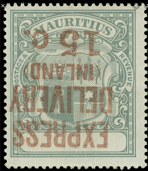
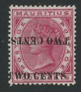
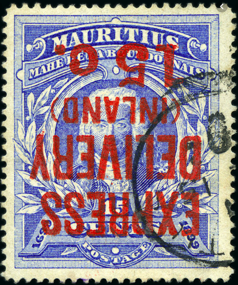
(iii) Overprint errors: An overprint is an extra layer of text or design that is applied to a stamp’s surface after printing. It is used mainly for administrative reasons or for commemorative inscriptions. Overprint errors can significantly increase the value of a stamp. Common errors include:
Missing overprint: Some stamps are only valid for postage when overprinted, and occasionally stamps without the overprint are issued in error.
Wrong overprint: When an overprint was initially intended for another stamp is used incorrectly.
Inverted overprint: The overprint is printed upside-down, often caused when a stamp sheet requiring multi-coloured impressions is inserted into a printing press the wrong way round. There are two basic variations which collectors need to know about this error:
- An inverted frame error is much less distinctive and only affects the frame orientation.
- An inverted centre is a type of invert error where only the central piece of the design is inverted
- Double impression: Stamp, or overprint, was printed twice, one impression offset from the other.
A few examples of inverted overprints exist on Mauritian stamps. Some include the following:

(iv) Invert error: Part of the stamp is printed upside-down. This type of error is viewed as the most spectacular type of error because of its noticeable appearance and its rarity.
(v) Colour error: A colour error occurs when a stamp has been printed in the wrong colour or with one or more of the intended colours missing. This can happen occasionally when the wrong ink is used in the printing machine at one stage of a multi-run printing process. There are different types of colour errors:
(a) Colour shift error:
A colour shift error happens when one or more of the printing cylinders are out of register, causing overlapping colours to create an interesting effect. These are among the most common errors. The value of a colour shift error depends on how visually striking the error appears.
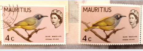
There are numerous colour shift errors in the 1968 birds and 1969 fish series. The list below is illustrative but not exhaustive. Only a few are highlighted.


(b) Missing colour error:
This happens when one or more colours are missing, because part of a multi-run printing process is missed. This can lead to major design features being omitted and often creates colour-omitted error stamps which are striking in appearance. This type of error is quite common in modern stamps.
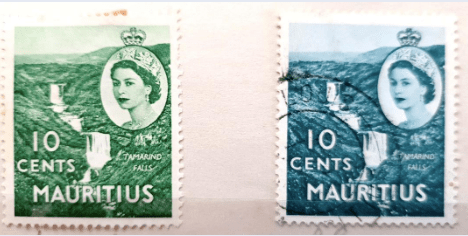
In 1953, in the definitive series released after the coronation of the Queen, a colour error occurred on the 10cs stamp: the initial stamp colour is olive green, while the stamp on the left has a darker colour, showing a missing colour error.
The 1968 birds issue has some interesting missing colour errors:


Other examples can also be mentioned: In the March 1972 stamp issue that marked the Royal Visit, the gold colour is missing in some stamps on the lower bar, featuring the words “Mauritius 15 cs”.
(vi) Watermark errors: Watermarks are incorporated on the paper on which stamps are printed to prevent counterfeiting and to give stamps a distinctive appearance. They are in the form of designs and letters. In Mauritius, three types of watermarks have been used:
(i) the St. Edwards Crown Block C.A;
(ii) the Multiple Crown Block C.A Diagonal; and
(iii) the Multiple Crown Script C.A Diagonal.
Many stamps series feature watermark errors. These are considered of major importance in philately. Most common ones are:
(a) Inverted watermarks, which happen when a sheet of watermarked paper is inserted into the printing press upside down;
(b) Sideways watermarks;
(c) Reversed watermarks; or
(d) Missing watermarks.
A special page will be dedicated to watermarks with illustrations and examples.
(vii) Paper error: This occurs when a stamp is printed on the wrong type of paper. For example, the paper used may have a different watermark, colour or thickness than what was originally intended.
(viii) Perforation error: Perforations are a series of small holes or apertures which are designed to enable easier separation of the stamps in a sheet. Errors can cause perforations to be missing on one or several sides or put in the wrong place (e.g. diagonally). As perforations may be removed by cutting them off, imperforate errors are collected in pairs. There are five main variations of perforation errors found in sheets of stamps:
(a) Imperforate between: The external sides of a pair of stamps are perforated correctly, but perforations which should exist between the pair are missing.
(b) Horizontal imperforation: A stamp sheet which doesn’t have any horizontal perforations, but does display its vertical ones.
(c) Vertical imperforation: A stamp sheet which has no vertical perforations, but does have its horizontal ones as normal.
(d) Misperforation or perforation shift: this relates to any inappropriate puncturing of a stamp sheet. This is caused because the sheet is not properly aligned with the perforating equipment. It can result in the perforation holes disfiguring the design of a stamp.
There are a few interesting misperforation errors on Mauritius stamps. The most spectacular one can be seen on the Birth of Philately miniature sheet of Port Louis Old and New series released in 1970. All the stamps on the miniature sheet are perforated outside the white margins, both on top and bottom of the sheet.
(e) Blind perforation, caused when a hole is not completely punched out.
(ix) Tête-bêche or head to tail errors: Occasionally one cliché (engraved die) on a plate is entered upside down in relation to the other clichés. Those items are collected in pairs or blocks.
(x) Inking errors:
Over-inking occurs when an excessive amount of ink is applied to a printing plate, causing an overly heavy impression on the stamp, making the design unrecognizable.
Under-inking, when too little ink to a plate is applied, usually at the end of a printing run. This can result in a very faint design which lacks colour and distinction.
Ink smears: A rarer occurrence than under-inking or over-inking. This is caused by applying an uneven distribution of ink to a plate which then smears to affect part of the stamp’s design.
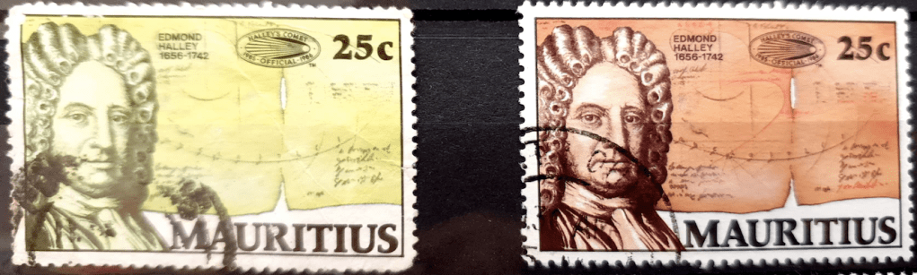
Albino errors: When the inking stage is completely missed, it can leave a blank impression or engraved image of the design with no colour. One such example can be highlighted below. It is a rare specimen of the 1986 series commemorating the Return of Halley’s commet. This 25 cs stamp exists with an albino error.
(xi) Offset errors: Considered to be a minor mistake, offset errors can be identified because they have a normal impression on the stamp’s front and an offset reversed impression on the reverse of the stamp.
(xii) Phosphor band errors: Although these are barely visible, missing phosphor bands or coatings result in some highly collectable stamps.
(xiii) Gum errors: In the early days, stamps were gummed manually. Errors occurred when stamps were gummed on both sides, on the wrong side, or with the wrong gum. Nowadays gum application is done by machines and pre-gummed paper is used for the majority of stamps.
(xiv) Miscuts, which can happen when a stamp sheet is misaligned with the guillotine blades. It creates a shift across the entire sheet and causes the perforations not to coincide with the stamps’ borders. Miscuts can result in just a few millimetres being clipped off a stamp design or a complete shift of the central image that results in a portion of an adjacent stamp coming into view. This was most in coil stamps, and in the early days when guillotines were used. Nowadays, automation has reduced the incidence of miscuts.
(xv) Unprinted areas: Caused by foreign objects becoming embedded on the stamp.
How do these factors impact on an error stamp’s value?
In most cases, the value of stamp errors is rather speculative. It is difficult therefore to estimate their true value, which is only realised when they come to market. The visual appeal, quality of the stamps and relative scarcity of a stamp error will ultimately define its philatelic value.
The more obvious the error or more visible the printing mistake, the higher philatelists are willing to pay. Likewise, the rarer an error stamp is, the higher the price.
If a certain type of error is known to exist in very limited quantities, they are prized by philatelists who are willing to pay significantly more to acquire them. This is the case of the Bordeaux cover, featuring both the two pence blue and one penny red stamps.
Obviously, the condition of error stamps has a major effect on their value; the better their condition, the more they are worth.
For this reason, error stamps that display rich colours, neat perforations and a crystal-clear design or subject at their centre are worth significantly more than poor error stamps with an obscure or off-centre design.
